

Showing posts with label blue. Show all posts
Showing posts with label blue. Show all posts
Saturday, November 10, 2012
Essie - No More Film
This color really changes depending on the lighting. While coming across as black or navy indoors, bright sunlight brings out deep violet tones. Very unique and pretty. The formula is excellent, can probably get away with one coat if you are careful.


Thursday, November 8, 2012
Essie - Fair Game
Fair Game is a slate blue/gray with a nice shimmer finish (but not too shiny for all you creme fans). The formula is smooth and you get great coverage in two coats. I love this on my toes, though it definitely makes an appearance on my nails from time to time.


Saturday, October 13, 2012
Color Club - Insta This
Insta This is another color from Birchbox's exclusive social media collection with Color Club. I own a few creamy blues, but this is definitely a new favorite. The formula is amazing, practically a one coater that dries to a nice shiny finish. I'm in love.


Wednesday, May 16, 2012
Zoya - Zuza
Oh Zuza. With a promo bottle photo like this, is it any wonder you went straight to the top of many polish fanatics wish lists?

Unfortunately I think that magic is sort of lost on the nail. A foil version of the ever so popular tiffany blue is a great idea, but in the end I simply prefer a creme. I wish Zoya did more of a glitter foil, like their sunshine or sparkle collections. If foils are your thing, this is probably a must have. Maybe I'll like it better with a tan, but I can't really see myself reaching for Zuza over it's creme counterpart (Wednesday).


Unfortunately I think that magic is sort of lost on the nail. A foil version of the ever so popular tiffany blue is a great idea, but in the end I simply prefer a creme. I wish Zoya did more of a glitter foil, like their sunshine or sparkle collections. If foils are your thing, this is probably a must have. Maybe I'll like it better with a tan, but I can't really see myself reaching for Zuza over it's creme counterpart (Wednesday).


Ok Zuza happens to be very photogenic and looks pretty in these photos, but I didn't really feel like it was *that* special in real life. Maybe I'm crazy and it'll grow on me. We'll see !
Monday, May 7, 2012
Essie Cocktail Bling with Zoya Maisie
I saw this beautiful photo of Zoya's Maisie layered over Kristen and had to try to recreate it immediately. Essie's Cocktail Bling is a muted gray/blue, and while it might not be as light as Kristen it certainly worked out well.
I've learned the thing about flakies is that they never ever look nearly as good in photos as they do in real life. Pictures make them look more odd and speckled whereas in person, flake polishes give off an awesome iridescent glow. They can look speckled in the shade with absolutely no light hitting them, but the tiniest bit of light makes them sparkle and shine and gives whatever color you layer it over a real boost.
I'm definitely a fan of layering flakies over base colors with similar tones. I really enjoyed the contrast of Maisie's blue/green flecks over the muted gray of cocktail bling. It was really hard capturing just how great this was, so you just have to trust me that this looked even better in person:


And here is Cocktail Bling alone. An awesome muted gray/blue that is just as lovely without a sparkly top coat.


I've learned the thing about flakies is that they never ever look nearly as good in photos as they do in real life. Pictures make them look more odd and speckled whereas in person, flake polishes give off an awesome iridescent glow. They can look speckled in the shade with absolutely no light hitting them, but the tiniest bit of light makes them sparkle and shine and gives whatever color you layer it over a real boost.
I'm definitely a fan of layering flakies over base colors with similar tones. I really enjoyed the contrast of Maisie's blue/green flecks over the muted gray of cocktail bling. It was really hard capturing just how great this was, so you just have to trust me that this looked even better in person:


And here is Cocktail Bling alone. An awesome muted gray/blue that is just as lovely without a sparkly top coat.


Wednesday, April 27, 2011
Essie - Lapis of Luxury
I recently saw Lapis of Luxury on a coworker and had to have it immediately. This cornflower blue jelly is slightly grayed out in real life, with a subtle hint of lavender that is nearly impossible to capture in a photo. These gray and lavender undertones are what make this polish a complete win for me. The second photo is a bit more accurate color wise.


Here it is with a coat of China Glaze - Black Mesh. This is a fun but I currently love Lapis too much to justify covering it with anything.


Here it is with a coat of China Glaze - Black Mesh. This is a fun but I currently love Lapis too much to justify covering it with anything.


Thursday, August 19, 2010
Sally Hansen - Lime Lights over China Glaze - For Audrey
Lime Lights is an iridescent mint green. It's very sheer on it's own, but quite magical as a top coat. Here it is over For Audrey - it gives it an awesome pearlized finish. I'm also excited to try this one over some darker colors.


Tuesday, August 3, 2010


Wednesday, July 21, 2010


Friday, May 21, 2010
Color Club - Gossip Column
One of the (only) good things about my polish no buy til july is that I can go back and revisit some of my favorite colors. Gossip Column by Color Club one of those. I bought it cause it seemed like a dupe for American Apparel - Peacock (or at least close enough to satisfy me). It's a nice saturated blue creme with a hint of green it in (it leans more blue in these photos).
The formula was great, it really only needs one coat but I used two cause I can't help myself. It did show signs of wear after 24 hours, which was kind of sad. I didn't use a base coat though so perhaps that was the issue.


The formula was great, it really only needs one coat but I used two cause I can't help myself. It did show signs of wear after 24 hours, which was kind of sad. I didn't use a base coat though so perhaps that was the issue.


Monday, May 17, 2010
Milani Liquid Metal for Summer (?)
Polish friends, I did something today that is probably a huge no no. I tried on polish in a drugstore (without buying). You see, I am currently starting week 2 of a 2 month no buy and I could not stay away from these colors. I mean, I had to make sure they were not worth purchasing, ya know?
The display that inspired my devious behavior was Milani's new Liquid Metal for Summer Collection. I might be making that name up. My mind was too distracted by metallic micro glitter to get a proper photo of the display, and the name of this collection is completely cut off. I think I remember seeing Liquid Metal so I'm just going to go with that.

Here are my quick and messy skittle swatches.
Pinky: Metal Gear (one coat) - a yellow/gold metallic.
Ring: Melt Down (one coat, probably not color accurate) - red metallic
Middle: Molten Rock - shimmery metallic teal
Index: Hot Metal - pink/purple jelly with pink and blue microglitter. This one is way more pink in person, but the microglitter gives it that bluish purple flash you see in the photo.


Ok people. I inherited a very stumpy thumb from my father. I really wanted to keep it off the internet, but I used it to swatch an awesome color so I have no choice but to feature it in this next photo. I'm sorry. This is Melt With You - orange metallic with gold microglitter. This one only one coat, I'm sure it's better with two. I don't really own anything like it so I might have to go back and purchase.

Molten Rock instantly reminded me of Zoya Charla. It's definitely in the same family, but the glitter is a lot finer so the finish is smooth and less glitzy. Charla also has a green duochrome effect. I really like them both, though part of me leans towards Molten Rock cause Charla is almost *too* sparkly for my fingers. They are different enough where owning both is extremely justifiable. Here is a quick side by side:

Thursday, May 13, 2010
Essie - Turquoise and Caicos vs. China Glaze - For Audrey
I was really excited to get Turquoise and Caicos in the mail, but when I opened it it looked very much like For Audrey! Actually, Turquoise is more green. That said, I wore a mixed mani with both for 3 day and no one noticed I had two different colors on.
As far as formulas go, both are not perfect. For Audrey is thicker and only needs 2 coats, the first goes on pretty uneven. Turquoise and Caicos is kind of sheer, needing 3 somewhat thick coats for it to be opaque. I found Turquoise to be a little easier to work with.
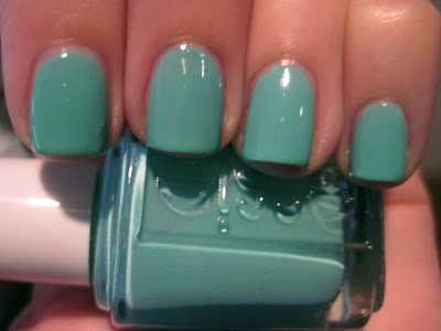


As far as formulas go, both are not perfect. For Audrey is thicker and only needs 2 coats, the first goes on pretty uneven. Turquoise and Caicos is kind of sheer, needing 3 somewhat thick coats for it to be opaque. I found Turquoise to be a little easier to work with.
Here is Turquoise alone (please excuse the the bumps on my index finger, I had some stubborn glitter stuck to my nail!):
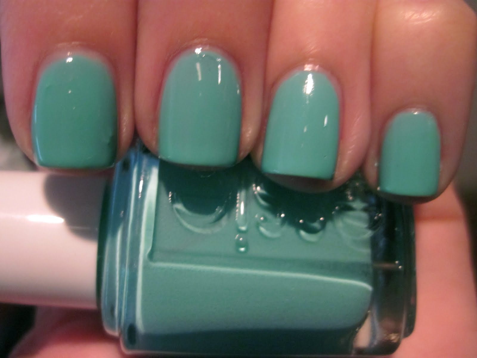
And a bunch of comparison shots:


These shots emphasize the difference in color. In low light they seem almost identical. You probably don't need both. So do I get rid of one? Of course not. A girl needs back up bottles of these things!
Tuesday, May 11, 2010
Zoya - Charla
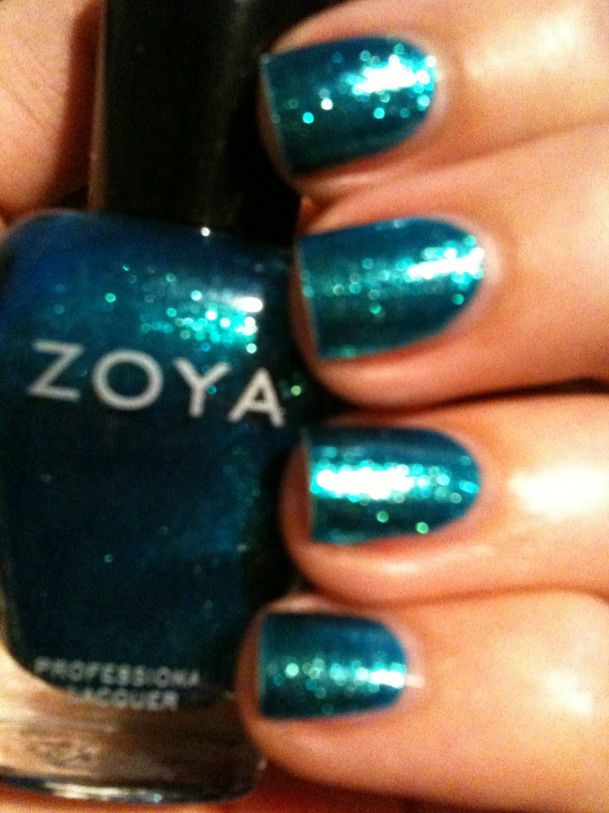
Oh Charla Charla Charla. I want to love you. I think I might love you. But I'm not sure if I'm in love with you on my fingers (yet). I've been wearing a series of purple/pink tones (which tend to look the best on me), so this mermaid manicure was a lil shocking to my eyes.
Don't get me wrong, this color is beyond gorgeous. It's a bright aqua base loaded with blue/green *metallic* glitter. I don't think any swatch online can truly capture how bright, saturated, and shiny this polish really is. Also, it's metallic! I didn't really realize that when I purchased, even though it's clearly stated in the product description. It's fabulous on my toes. Still getting used to it on my nails.



Saturday, April 24, 2010
Diamond Cosmetics - Don't Teal My Heart Away
I have such love for this brand! Fun colors, great formula (just as good as essie/opi, if not better in some cases), and $2.25 a bottle - cant' really beat that. Here is Don't Teal My Heart Away, a really nice teal cream. Available at flossiediamond.com


Tuesday, April 20, 2010
China Glaze - Metallic Muse
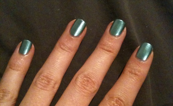
This is not a color I would normally go for, but it was on sale at Sally's so I figured why not. Turns out it's completely awesome! It is extremely smooth and shiny, like liquid metal. Silvery colors usually look odd on me but I think the shine factor adds a certain brightness that makes it work really well. It is definitely the most reflective polish I own. This is part of last fall's Khrome collection, I plan on getting Millennium and perhaps Robotika in the future.
I used Beauty Secrets ridge filler and am really pleased with the results. This is two coats, but you can probably get away with one if you are careful. Oh and it dries really fast and doesn't even need a top coat.

Subscribe to:
Posts (Atom)
LinkWithin
