

Showing posts with label creme. Show all posts
Showing posts with label creme. Show all posts
Saturday, November 10, 2012
Essie - No More Film
This color really changes depending on the lighting. While coming across as black or navy indoors, bright sunlight brings out deep violet tones. Very unique and pretty. The formula is excellent, can probably get away with one coat if you are careful.

Saturday, October 13, 2012
Color Club - Insta This
Insta This is another color from Birchbox's exclusive social media collection with Color Club. I own a few creamy blues, but this is definitely a new favorite. The formula is amazing, practically a one coater that dries to a nice shiny finish. I'm in love.


Monday, September 10, 2012
China Glaze - Flip Flop Fantasy
I know fall is quickly approaching, but I cannot return to this blog without paying homage to the neon that was on my fingers and toes for the majority of the summer.
Flip Flop fantasy is obnoxiously bright. The first time I put it on I hated it because I simply was not used to my fingertips glowing. After the initial shock wore off, I found I kept returning to this polish because of how loud it is.
The intensity of this color drives cameras insane, but I managed to capture it's essence in this instagram collage. The formula is not wonderful, but most neons aren't. It also chips pretty easily. All is forgiven though, since there seems to be no other quite like it.

Color Club - Tweet Me
Oh bloggy blog blog, how I ignore you. I'd love to promise that I'm back for good, but by now you all know how fickle I am.
So what has motivated me to post? Birchbox and Color Club's exclusive Social Media collection! I was lucky enough to score 2 of these at Birchbox's pop up sample stop for fashion week.
Tweet me is a creamy chartreuse, a color I hated when OPI did it with their Shrek collection but absolutely love now. It's one of those things that's so ugly it's pretty.
The polish comes across extra yellow in these photos, but there is definitely a dose of green in it. The formula was a bit awful, as any formula with yellow tends to be, but after three coats it evens out pretty nicely.

Friday, May 6, 2011
Opi - Stranger Tides
Yo ho ho! Arghg! Other cliche pirate phrases! Stranger Tides is from OPI's latest Disney themed Pirates of the Caribbean collection. It is a very pale, almost khaki green creme. It is pretty unusual, don't think I've seen anything else like it.
I found the formula a tad bit annoying. It managed to be both thick and streaky at the same time (a common problem with pastel cremes). There was also some cuticle drag (for my non polish obsessed friends, this is when applying a second or third coat starts pulling off previous coats and leaves bare spots near the cuticle.) I had to wait a few minutes between each coat to avoid this and needed 3 coats (one thin, two thick) for full coverage.
In the end, I absolutely adore this color, though I'm not quite sure how I feel about it with my skin tone. I'm excited to wear it once I'm tan. I think this will look great on cooler complexions and also on deeper skin tones (aka everyone but me).
Now I must hunt down Silver Shatter so I can frolick around with trendy nails and ignore strange looks from people who just don't understand.


Sunday, April 24, 2011
Chanel - Khaki Vert
I very rarely pay full price for a bottle of polish, so if I splurge on a Chanel it has to be something special. Luckily, Khaki Vert lives up to all its expectations. It's a perfect slightly grayed out army green. This is two coats.


Friday, August 20, 2010
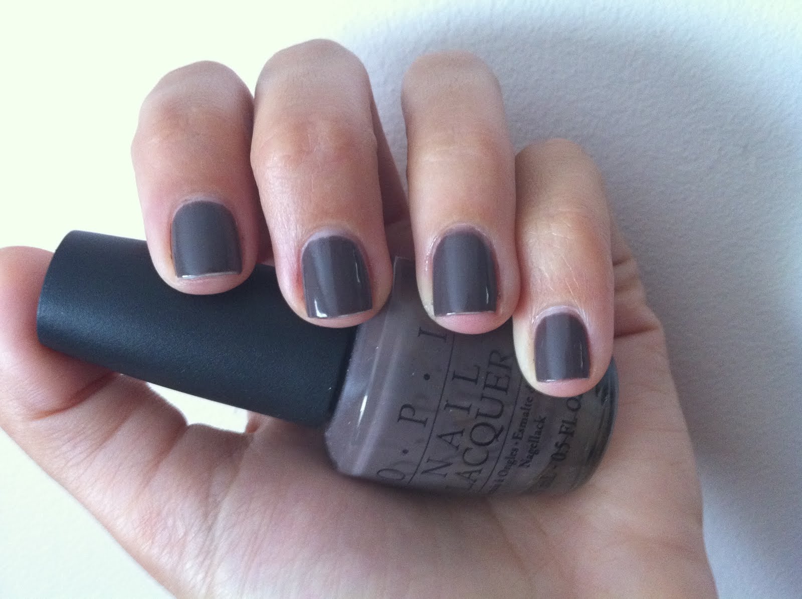
OPI - You Don't Know Jacques
I needed a break from my summer colors so I grabbed a fall favorite - OPI's You Don't Know Jacques. There are tons of other colors in this family, but I love YDKJ cause I think its the perfect balance of purple taupes (like Metro Chic) and brown ones (like Particuliere).


You can check out a ton of taupe comparisons here: Little Music Boxes: Chanel Particuliere Comparison and here: Little Music Boxes: Another Purple Taupe Comparison.


Wednesday, August 11, 2010
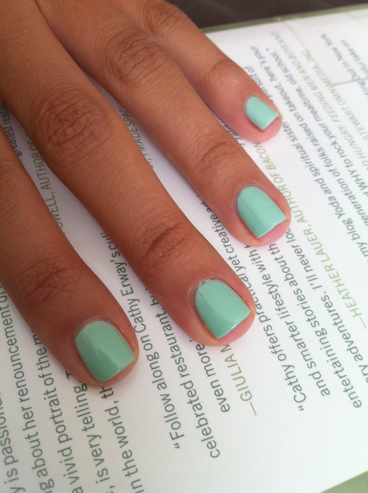
Revlon - Minted
I love this color! This goes right up there with For Audrey as one of my favorite colors to wear with a tan. Minted is very similar to Essie's Mint Candy Apple; however I believe this one looks more green on me where Mint Candy Apple leaned more blue. Formula was easy to work with, but definitely needed 3 coats.


Monday, July 26, 2010
Color Club - Peppermint Twist
Just spent a wonderful weekend with family, including my 5 year old cousin Maria. We had matching manicures all weekend! (For Audrey looked absolutely adorable on her, unfortunately I managed to lose the photo I snapped). Here we are with Color Club - Peppermint Twist and a watermelon design on our ring fingers. I used Sinful - Rise and Shine and a black sharpie for the design (the sharpie worked surprisingly well). Look how cute!


Wednesday, July 21, 2010


Monday, July 19, 2010
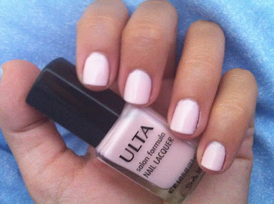
Ulta - Baby Doll
Decided to change things up with a pale polish. Baby Doll is a really soft pink. Looks awesome with a tan.
Formula was nice, but needed 3 coats for full coverage.


Thursday, July 1, 2010
Loreal - Target Red with Orly - Rage tips
Apologies for abandoning this blog for so long! Have been caught up with other things and taking photos of my nails kind of fell to the wayside.
I have been wearing Loreal - Target Red, which is a perfect red cream sold exclusively at target. Of course I got bored and decided to dress it up, giving myself a makeshift french with Orly - Rage. Rage is advertised as a rose gold, but it it comes across as a bronze/silver/gold depending on the light.
The red is coming off a little brighter than it is in real life. Oh and excuse my messy tips, I did them by hand and they are not perfect.


I have been wearing Loreal - Target Red, which is a perfect red cream sold exclusively at target. Of course I got bored and decided to dress it up, giving myself a makeshift french with Orly - Rage. Rage is advertised as a rose gold, but it it comes across as a bronze/silver/gold depending on the light.
This looks really great in person. It's perfect for the Chinese New Year, too bad I'm about 3 and a half months late on that one :)
The red is coming off a little brighter than it is in real life. Oh and excuse my messy tips, I did them by hand and they are not perfect.


Awkward dog photo!

Wednesday, June 2, 2010
OPI - The "It" Color
Hello polish friends!
Sorry for the lack of updates. I wore Rise and Shine for almost a week - a record for me! It really is one of my favorites.
Now for one of my least favorites: OPI's The "It" Color. It's a warm orange toned yellow. I really thought this would look nice on me, but it's not very good. Things it reminds me of: school buses, caution signs, cheez wiz, my tube of toothpaste (see photo).
The formula is miserable. It's sheer and streaky and needed 4 coats to cover all the bare spots.


Friday, May 28, 2010
Sinful Colors - Rise and Shine
This color is gorgeous, but pretty much impossible to photograph. It's a teal green (much greener than blue, but there's definitely some blue in there) and has a very subtle shimmer. It comes across as soft in these photos, but in reality is a totally awesome vivid green. I think this might be my favorite summer polish so far!
Formula was great for a $2 polish. Needed 3 coats to cover bare spots, but went on smooth enough that I didn't mind. It acts like a neon in that it dries very fast, matte, and photographs much duller than it is in real life, but I would not classify this color as a neon. You definitely need a top coat.


Friday, May 21, 2010
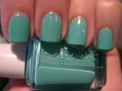
Color Club - Gossip Column
One of the (only) good things about my polish no buy til july is that I can go back and revisit some of my favorite colors. Gossip Column by Color Club one of those. I bought it cause it seemed like a dupe for American Apparel - Peacock (or at least close enough to satisfy me). It's a nice saturated blue creme with a hint of green it in (it leans more blue in these photos).
The formula was great, it really only needs one coat but I used two cause I can't help myself. It did show signs of wear after 24 hours, which was kind of sad. I didn't use a base coat though so perhaps that was the issue.


The formula was great, it really only needs one coat but I used two cause I can't help myself. It did show signs of wear after 24 hours, which was kind of sad. I didn't use a base coat though so perhaps that was the issue.


Thursday, May 13, 2010
Essie - Turquoise and Caicos vs. China Glaze - For Audrey
I was really excited to get Turquoise and Caicos in the mail, but when I opened it it looked very much like For Audrey! Actually, Turquoise is more green. That said, I wore a mixed mani with both for 3 day and no one noticed I had two different colors on.
As far as formulas go, both are not perfect. For Audrey is thicker and only needs 2 coats, the first goes on pretty uneven. Turquoise and Caicos is kind of sheer, needing 3 somewhat thick coats for it to be opaque. I found Turquoise to be a little easier to work with.


As far as formulas go, both are not perfect. For Audrey is thicker and only needs 2 coats, the first goes on pretty uneven. Turquoise and Caicos is kind of sheer, needing 3 somewhat thick coats for it to be opaque. I found Turquoise to be a little easier to work with.
Here is Turquoise alone (please excuse the the bumps on my index finger, I had some stubborn glitter stuck to my nail!):
And a bunch of comparison shots:


These shots emphasize the difference in color. In low light they seem almost identical. You probably don't need both. So do I get rid of one? Of course not. A girl needs back up bottles of these things!
Monday, May 10, 2010
OPI - Pamplona Purple
A perfect purple! Received lots of compliments on this one. Here are two sunlight photos (looks a lil more reddish indoors):


Subscribe to:
Posts (Atom)
LinkWithin
